


- Elizabeth Valdelamar
- Mar 7
- 21 min read

Updated: Jul 3

🎨 My Creative Journey at BNSF Railroad
I had the incredible opportunity to work with BNSF Railroad for 3 years, where I wore multiple creative hats and explored several facets of design and storytelling.
👩💻 Primary Role – UI/UX Designer
I led the design of user-friendly interfaces and helped modernize legacy platforms to improve the overall user experience. Working closely with developers and stakeholders, I brought clarity and usability to complex systems.
🎨 Graphic Designer
Alongside UX, I created visually engaging graphics that aligned with the brand and communicated effectively across internal and external audiences.
📸 Photographer & Camerawoman
I captured the energy and operations of BNSF through high-quality photos and videos—highlighting both culture and process with a strong narrative focus.
🎥 Multimedia Coordinator ("Puppet Master")
I managed multimedia projects end-to-end—ensuring that video, graphics, and storytelling elements came together smoothly for presentations, campaigns, and marketing materials.
🏗 Architectural Contributor
I even contributed to the structural and spatial design side of projects, helping align form with function—bridging design aesthetics and practical use.
🤝 Teamwork with the Experience Design (XD) Team
Collaborating with the talented XD Team, we tackled challenges, celebrated wins, and consistently delivered innovative solutions that elevated design across the organization.
💡 This journey not only sharpened my creative and technical skills but also deepened my passion for cross-disciplinary collaboration, storytelling, and user-centered design.

🎯 UX Research Objective
To evaluate and improve the usability, effectiveness, and satisfaction of digital tools within the BNSF Railway portfolio, ensuring they meet the needs of stakeholders (e.g., customers, employees, operators, logistics teams).
🔍 1. Define Scope & Goals
Portfolio May Include:
Customer Portal (booking, tracking, billing)
Employee Portals (scheduling, reporting, maintenance logs)
Mobile Apps
Internal Tools (logistics, asset management, safety)
Public Website
Key Research Goals:
Identify usability issues across platforms
Understand user workflows and pain points
Prioritize improvements for accessibility and performance
Uncover unmet user needs
👤 2. Stakeholder & User Identification
Stakeholders:
Logistics managers
IT team / product owners
Field operation supervisors
Marketing / communications
User Groups:
Freight customers
Field employees (engineers, conductors)
Office employees
Third-party contractors (e.g., maintenance crews)
Regulators (indirectly)
📋 3. Research Methods
🧭 4. Research Plan Timeline
🧠 5. Deliverables
Personas
Journey Maps
Pain Points Summary
Task Analysis
UX Audit Report
Usability Metrics (SUS scores, task success)
Recommendations Roadmap
📌 Next Steps
Would you like me to:
Create a presentation or PDF with this?
Draft sample interview or usability test scripts?
Design a stakeholder or user recruitment plan?
Design System - Gel - Material Library
UI/UX - Projects
Design System - Gel - Material Library for TSS 2.0
🧩 GEL Design System – Unifying BNSF’s Digital Experience
🖼️ Hero Image or Header Banner
Full-width image showcasing a snapshot of the GEL Design Library in Figma or a side-by-side of before/after UI components.
Overview
Tools: Figma, Bootstrap Material, React, Angular
The Challenge
Despite having a developer-focused GEL (Global Experience Language) component library, there was no shared, practical design resource for designers. The lack of a centralized design system led to inconsistent UI, duplicated work, and misalignment across teams.
Key Issues:
No “source of truth” for designers
Fragmented visual styles
Inefficient design-to-dev handoff
My Role & Strategy
I led the initiative to bridge design and development by transforming GEL into a full-fledged design system. I advocated for Figma as a shared platform and converted brand guidelines into ready-to-use components.
Key Actions:
Organized cross-functional workshops
Built a unified Figma library with badges, pills, alerts, buttons, etc.
Mapped brand colors and typography directly into reusable styles
Collaboration Workflow
The Solution: Figma GEL Library
The result was a living, cloud-based design system aligned with both branding and developer guidelines—used consistently by 6+ designers across multiple TSS 2.0 projects.
🟧 Key Features:
Brand-aligned color tokens (badges, pills, alerts)
Responsive components following Material principles
Scalable structure for new features and apps
Easy design-to-dev translation
📸 Component Gallery (Insert images here)
Badge Styles & Use Cases
Button Variants with States
Typography Scale
Color System Applied Across Apps
Figma Library Sample with Layers/Organization
Impact
✅ Unified UI across apps✅ Improved team efficiency✅ Consistent user experience✅ Better alignment between design and development✅ Quicker turnaround from concept to implementation
Below are examples from the original BNSF GEL Guidelines Library, which primarily catered to developers 👨💻 with a limited set of components and technical documentation. Using these foundational guidelines, I translated the system into a robust, shareable Figma design library 🎨—ensuring consistency and accessibility for both designers 👩🎨 and developers across projects. - please view images below.


🧩 Building a Scalable UX Design Library
From foundational elements to variable components, the BNSF Design Library was developed as a living, evolving system—designed to support both product design and internal team needs.
Using the official GEL (Global Experience Language) Guidelines and BNSF’s approved branding, I built a centralized Figma library that ensured consistency across applications and deliverables—including wireframes, prototypes, and XD team presentation slides.
To enhance flexibility and accessibility, I implemented Figma Variables and Tokens to enable both Light and Dark Modes, allowing teams to preview and adapt designs across different themes with ease.
As the library matured, it grew collaboratively with input from fellow designers, who contributed new components based on evolving user needs. These contributions were reviewed, refined, and incorporated into the shared Figma library—promoting consistency across teams while supporting customization where needed.
To ensure transparency and adoption, we communicated library updates and new additions regularly through team meetings and emails, fostering alignment and shared ownership across the design team.
By 2025, the system was on track for a modernization update—aligning with the latest Bootstrap framework and full Angular/React support, ensuring scalability and seamless integration with development pipelines.
📁 Visual Preview
Below are a few examples showing how each section of the Figma library was organized—dedicated pages for foundational styles, UI components, themes, and reusable tokens—empowering cross-functional teams to design and build with consistency and speed.


Modernizing Legacy Systems & Intranet for TSS 2.0
Role: UX/UI Designer
Duration: 3 Years
Focus Areas: User Research, Interaction Design, Visual Design, Wireframing & Prototyping, Usability Testing, UX/UI Audits
Design System: GEL Library (Figma)
Tech Stack (Design + Dev): React, Angular, Java, Bootstrap, Font Awesome
🔍 Project Overview
At BNSF Railroad, I led UX/UI design efforts to modernize a suite of internal green-screen legacy applications into efficient, intuitive web-based platforms. This initiative supported a broader SaaS transformation of BNSF’s internal asset organization systems—bringing them in line with modern web standards, brand guidelines, and usability expectations. Throughout the project, I collaborated closely with over 15 product owners to ensure alignment across teams and deliver user-centric solutions that met complex operational needs.
Over three years, I worked across six large-scale projects, each focused on key operational areas, including:
TSS: Customs
TSS: Customs – Chain of Custody
TSS: Terminal
TSS: Terminal – Crew View
TSS: Intermodal
GEL Design System Library (Figma)
⚙️ Challenges & My Role
The legacy systems relied on outdated color schemes, memorized keyboard commands, and inconsistent UI patterns—resulting in steep learning curves, inefficiencies, and low accessibility. My role was to translate these command-line interfaces into user-friendly, click-based UIs while preserving critical functionality and aligning with brand-approved design principles.
Key Contributions:
🎯 User Research & Testing:Conducted interviews and observations to map current workflows and identify friction points.
🧩 Design System Leadership:Created and maintained the GEL (Global Experience Language) design system in Figma. I used BNSF's branding reference guide to define scalable components—such as badges, pills, forms, and tables—and resolved inconsistencies between designer and developer libraries.
🖥 Architecture & Simplification:Broke down complex legacy screens and restructured them into simplified, modern UI patterns with clear visual hierarchy, streamlined navigation, and reduced cognitive load.
🤝 Cross-Team Collaboration:Worked with Product Owners, UX peers, architects, and offshore developers via weekly syncs. We held designer meetings to ensure consistency and developer meetings to align on UI requirements and component ETAs.
🎨 Visual & Interaction Design:Delivered high-fidelity prototypes built with Bootstrap behaviors, Java-friendly layouts, and React-/Angular-compatible components using the GEL Library.
✅ Solutions & Results
Streamlined UX:Reduced multi-screen workflows to single-page or tabbed views—minimizing steps and simplifying navigation.
Modernized Aesthetics:Applied brand-consistent colors, typography, and spacing to replace the outdated legacy UI without sacrificing usability.
Reusable UI Components:Built modular components used across projects, accelerating dev cycles and maintaining consistency.
Enhanced Accessibility & Recognition:Used Font Awesome icons and Bootstrap’s grid to ensure responsive and accessible experiences.
User-Centered Results:Internal teams reported higher satisfaction, faster onboarding, and greater efficiency with the new systems.
🖼️ Visual Example
--
Caption:Example of a modernized legacy interface redesigned using the GEL Library, simplifying navigation and applying updated color and interaction standards.
💡 Outcome
This initiative was more than a design facelift—it was a deep transformation of internal tools, user workflows, and team collaboration. By translating technical complexity into clean, brand-aligned UIs and building a unified design system from the ground up, I helped BNSF evolve their digital ecosystem into a scalable, user-focused platform that continues to serve teams across operations.
TSS 2.0:Project Notes & Collaboration + Flow Chart
The screenshot below captures detailed notes from collaborative meetings with the Product Owner's (PO) and development team. These notes play a critical role in aligning project goals with stakeholder expectations.
During each session, we carefully analyzed:
✅ Existing features within the current framework
🔧 Functionalities that needed to be built from scratch
🎯 Stakeholder priorities and user needs
This ongoing evaluation helped us create a clear roadmap—one that balanced available resources with new development efforts. By thoroughly documenting these conversations, we ensured alignment across teams, identified potential challenges early, and uncovered opportunities to enhance the user experience while meeting business objectives.


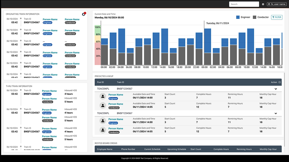
TSS 2.0: Train Schedules
📌 Project Overview
TSSL 2.0 (Train Schedules) was an internal-facing tool housed on the BNSF intranet, designed to coordinate and communicate critical train movement data. Originally developed in Axure RP 9, the application was grandfathered into my lap as a handoff from a senior UX designer moving on to other priorities. It became one of the first projects I tackled at BNSF during my deep dive into legacy system modernization.
This project came at a time when BNSF was just beginning to standardize design practices—Figma was newly adopted, and a consistent design system was still forming. I was challenged to reverse engineer outdated wireframes with limited documentation, while maintaining legacy integrity and aligning future updates with the growing BNSF GEL (Global Experience Language) system.
⚠️ Challenges
Inherited project with limited documentation
Created pre-Figma and pre-design system
Visually inconsistent interface with low usability
Needed to integrate new features while staying faithful to legacy needs
Required a balance between technical constraints and modern expectations
🛤️ Understanding Train Scheduling at BNSF
Internal train schedules, also known as timetables or train orders, are essential for planning and coordinating train movements. These systems help prevent collisions, organize traffic on shared tracks, and provide critical operational information. Some of the core scheduling responsibilities include:
📋 Planning & Coordination: Defining train arrivals/departures, managing simultaneous use of tracks
🧭 Real-Time Orders: Issuing train orders to adjust schedules and respond to on-the-ground conditions
🚦 Operational Safety: Warning crews of temporary hazards and granting movement authority
🧰 Logistics Management: Tracking yard schedules, coordinating mixed freight, and planning routing visuals
🛠️ My Approach
🔍 Reverse Engineering
Dug into Axure RP 9 to understand the original file structure, navigation logic, and user intent
Reconstructed interaction flows to clarify user journeys and pain points
🙋 User Feedback
Conducted interviews with internal users and dispatch staff
Learned the importance of immediacy—users wanted data front-and-center, not buried in clicks
🎨 Design System Alignment
Maintained visual consistency with the original design
Gradually introduced design tokens, spacing logic, and components from BNSF's emerging GEL library
💡 Modernization Enhancements
Added interactive map components to show real-time train positions
Incorporated color-coded train status indicators to quickly convey availability, delays, or warnings
Improved typography, spacing, and overall visual hierarchy for better scannability
✅ Outcome
This project became a pivotal moment in my growth as a UX designer at BNSF. Through reverse engineering and strategic modernization, I transformed a legacy tool into a forward-thinking interface—without compromising on operational familiarity.
The work also played a vital role in establishing UX consistency and design standards for future projects, and gave me hands-on insight into the high-stakes environment of freight logistics and how design impacts coordination and safety across one of the largest rail networks in the U.S.
🧠 What I Learned
Design isn’t just about clean UIs—it’s about navigating what exists, honoring the user’s needs, and aligning with organizational change
Working within legacy constraints sharpened my critical thinking and design advocacy
Train schedules are more than numbers—they're operational lifelines for massive logistics systems
Live web based Application

Axure

Figma

TSS 2.0 : Customs and Borders
TSS 2.0 – Customs & Borders is a modernization effort of legacy intranet screens used by BNSF teams to manage cross-border rail activity between the U.S., Canada, and Mexico. The original system, deeply embedded in green-screen legacy platforms, required a significant UX/UI overhaul to meet modern usability standards, support complex logistics, and streamline customs tracking.
🌍 Problem StatementThe legacy interface lacked clarity, consistency, and the ability to easily track cargo types and border activity. With high volumes of trains crossing northern (Canada) and southern (Mexico) borders daily, BNSF needed a more intuitive, accurate, and scalable system to monitor and report on various railcar types and entry/exit points.
🚂 Train Car Types Tracked:
🟥 BOXCARS
🟫 HOPPER CARS
🟦 FLATCARS
⚫ TANK CARS
🟨 GONDOLAS
🔵 COIL CARS
🧊 REFRIGERATOR CARS
🟪 SPECIALTY CARS
The system needed to clearly show which cars were crossing borders, from where, and to where, including entry/exit timestamps and cargo classifications.
🛠️ My Role & Approach
Inherited Legacy Screens: Conducted a UX audit of existing intranet screens to identify usability issues.
Axure → Figma Migration: The project originally began in Axure RP 9. I led the transition to Figma to improve design consistency, streamline collaboration, and align with BNSF’s emerging design system.
User Flow Redesign: Created improved workflows that visualized cross-border logistics clearly.
Data Simplification: Translated dense, legacy data into clean, interactive UI components for easier interpretation.
Design System Alignment: Worked to align redesigns with BNSF’s broader design standards as they were being defined.
Cross-Functional Collaboration: Partnered with product owners, developers, and customs operations teams to validate data accuracy and compliance.
🌟 OutcomeThe redesigned Customs & Borders tool allowed internal teams to more efficiently track border activity by car type and cargo load, improving operational visibility and reducing errors. The migration to Figma not only enhanced visual and interaction consistency but also supported BNSF’s larger goal of system-wide design unification across its internal tools.

TSS 2.0: Customs>Chain of Custody
Application Used: Axure & Figma{description}
{Images}
Axure
{image}
Figma
{image}
TSS 2.0 : Customs and borders > Chain of Custody
📌 Overview
As part of the TSS 2.0 suite, the Chain of Custody module was developed to modernize how BNSF tracks the secure handoff and management of sensitive and regulated cargo—particularly hazardous materials—across the rail network. This system was built natively in Figma and aligned closely with the Customs & Borders module to support safe, compliant, and accountable freight movement across U.S. borders and terminals.
⸻
🚨 Problem Statement
The original interface was based on outdated intranet screens, lacking modern UX conventions and design cohesion. These tools made it difficult to visualize asset handoffs, often requiring users to jump between fragmented data sources. This impacted regulatory compliance, internal communication, and operational efficiency.
⸻
🛡️ Why Chain of Custody Matters at BNSF
BNSF, like other major freight carriers, follows strict chain-of-custody protocols, especially for hazardous materials and sensitive cargo, to maintain safety and accountability throughout the supply chain.
• Purpose: Tracks every point of contact in an asset’s journey—who handled it, when, and why.
• BNSF’s Responsibility: Comply with regulations like 49 CFR 1580.205, which govern secure handoffs of sensitive cargo.
• Process: Includes physical inspections, secure holding, and documentation of custody transfers.
• Security Measures: Supports BNSF’s broader supply chain protection strategy with built-in safeguards.
• Example: When a railcar carrying hazardous materials is handed off, it must be inspected, placed in a secured location, and formally recorded.
• Outcome: Ensures shipment integrity and provides full visibility from origin to destination.
⸻
🛠️ My Role & Approach
• Took over UX/UI ownership to translate outdated intranet-based screens into modern, user-centric interfaces
• Designed and prototyped directly in Figma, improving consistency and collaboration across teams
• Integrated the evolving BNSF Design System to ensure branded, accessible, and scalable design patterns
• Worked cross-functionally with product owners, developers, terminal operators, and security compliance teams
• Enhanced workflows with visual timelines, modular forms, and real-time status indicators
⸻
🔧 Key Design Actions
• Legacy Translation: Audited existing intranet screens to understand data structures and workflows
• Modern Redesign: Rebuilt screens from the ground up using BNSF’s standardized design system
• Consistency: Ensured alignment with other TSS 2.0 modules like Customs & Borders for a seamless experience
• Usability Testing: Validated interactive flows with operational teams to reflect real-world use cases
⸻
📊 Key Features Introduced
• Custody timeline visualizations with clear roles, timestamps, and event types
• Color-coded status tags for exceptions and delays
• Smart filtering by location, car ID, cargo type, or custody step
• Regulatory documentation fields for compliance tracking
• Integrated handoff view with Customs & Borders system
⸻
🌟 Outcome
By modernizing the Chain of Custody module, BNSF achieved a more transparent, compliant, and intuitive system for tracking cargo movements. The redesign not only improved usability and real-time coordination but also ensured that the platform met federal security regulations and internal design standards. Transitioning from legacy intranet screens to Figma-based design system components helped unify the experience across platforms and future-proof the tool for ongoing enhancements.
TSS 2.0: Terminal Management
Terminal Management
Application Used: Axure & Figma
{description}
150-+ PLUS Screens = Terminal Management
Who are the Users?
-The Customer Care Respresentive / Terminal Manager / Screen Not role Based
-Everyone will have read access / anyone who has a cces to TSS 2.0
📌 OverviewAs part of the TSS 2.0 modernization initiative, the Terminal Management project focused on redesigning and streamlining the interface for one of the most critical components of BNSF’s operations. Rail terminals are the start and end points of freight movement—handling everything from sorting, staging, and scheduling to managing mixed cargo operations across a vast and complex network. The existing system relied heavily on fragmented legacy green screens and outdated intranet interfaces, which limited usability, visibility, and operational efficiency.
🚨 Problem StatementThe legacy system lacked visual hierarchy, intuitive workflows, and scalability. Terminal staff often had to navigate multiple disconnected tools to manage train schedules, inventory, and sort operations. This fragmentation resulted in:
Delays in real-time coordination
Manual errors in routing or cargo handling
Poor usability across teams
A lack of consistent design across tools
🎯 ObjectiveRedesign the Terminal Management platform to:
Modernize legacy and intranet-based screens
Align with BNSF’s evolving brand and design system
Provide real-time visibility into terminal operations
Centralize data across terminals for better coordination
Enhance user experience for dispatchers, operators, and support staff
🛠️ My Role & Approach
UX/UI Design Lead: Took ownership of the project through user research, wireframing, high-fidelity UI, and usability testing
Legacy System Audit: Conducted a full evaluation of existing screens to identify redundancies, pain points, and workflow inconsistencies
Terminal Personas & Journeys: Collaborated with terminal staff, product owners, and field supervisors to build accurate personas and task flows
Design System Integration: Leveraged and expanded BNSF’s internal Figma-based design system to ensure consistent branding, components, and accessibility
Cross-Functional Collaboration: Partnered with 15+ product owners, developers, and stakeholders to define requirements, iterate, and execute smoothly
Scalable UI Design: Built flexible interface patterns to adapt to various terminal sizes and operational models
📊 Key Features Introduced
Interactive terminal dashboard with train and cargo status
Drag-and-drop functionality for yard sorting operations
Color-coded train classifications for quick scanning
Smart alerts for congestion, delays, or missing data
Role-based views tailored to dispatchers, managers, and field teams
🌟 OutcomeThe redesigned Terminal Management system improved operational coordination, reduced reliance on manual inputs, and introduced a modern, intuitive interface aligned with BNSF's brand and design guidelines. The transition empowered terminal teams to manage freight more efficiently—supporting the broader goal of strengthening the U.S. rail freight and logistics supply chain.


TSS 2.0: Hi-Wide
🚛 Hi-Wide Application Modernization
UX Case Study | BNSF Railway
📌 OverviewThe Hi-Wide project centered on improving an existing internal web application used to manage oversized freight shipments—also known as dimensional loads. These include heavy equipment, military cargo, and specialized industrial components that exceed standard railcar dimensions. The project aimed to modernize workflows while operating within the constraints of Angular 5, and without altering the existing application core.
BNSF’s goal was to add critical missing functionality from legacy green-screen tools, while modernizing the interface, aligning with brand standards, and mentoring a new UX designer on our team.
🚨 Problem StatementThe live Hi-Wide application lacked modern UX patterns and was missing key functionality that operators still relied on via legacy green screens. Core development updates were not allowed due to system restrictions. Challenges included:
Limited UI flexibility within Angular 5
Missing functionality not migrated from legacy systems
Disconnected workflows across planning, clearance, and inspection
Need to onboard and support a new designer mid-project
🎯 Objectives
Enhance usability of the existing app without changing its technical core
Migrate missing green screen functions into the modern UI
Align designs with BNSF’s GEL library and accessibility standards
Improve layout, interaction flow, and visual hierarchy
Mentor and onboard a new designer into GEL and Figma workflows
🛠️ My Role & Approach
Lead Designer & Mentor: Directed the design strategy while guiding a junior designer on best practices, GEL components, and responsive patterns
Figma-First Process: Developed enhanced screen designs, layouts, and flows for missing green screen functions, including:
Dimensional load detail entry
Clearance route mapping
Special car type selection (e.g., Schnabel, flatcar)
Regulatory inspection workflow
Functional Gap Identification: Collaborated with Product Owners and subject matter experts to identify legacy workflows not yet transitioned to the web app
Design Within Constraints: Worked within Angular 5’s limitations, ensuring designs were feasible and compatible with current code structure
Cross-Team Coordination: Partnered with developers and QA to validate designs, address limitations, and iterate efficiently
📊 Key Enhancements Delivered
New screens replicating and extending green screen functionality
Improved navigation and searchability of hi-wide shipment records
Visual flagging for over-dimension issues and required inspections
Functional enhancements such as:
Oversize load validation
Real-time clearance warnings
Asset assignment and approval flow
Full integration with GEL: buttons, alerts, tables, modals, color tokens
🚆 Domain ContextHi-Wide (dimensional) shipments require intense planning and routing:
Use of flatcars or Schnabel railcars
Coordination with route clearance rules
Compliance with height/width thresholds for bridges, tunnels, and terminals
Special regulatory handling and safety inspections
🌟 OutcomeThis modernization brought functionality parity with legacy tools and improved usability for hi-wide planning—without needing codebase changes. The updated UI supported better decision-making, reduced error risk, and improved operator experience. The onboarding and mentorship of a new designer also resulted in increased design capacity for the UX team and broader adoption of BNSF’s design system across parallel projects.
Let me know if you want this turned into a slide, portfolio section, or infographic format!
Live Application:


PO reach other to add mpre functionalty to this application that was runnning on a old version of agular, The application was not updating any code just adding more functionality and eaier use, as well as adding more screens from Green Screens, at this time we had a new designer in our team, i was put to the task to train and help designer to learn Gel Libraries , BNSF appoved colors and having to work around Agular 5, Consulting and overseeing the designer
Application Used:Figma
Terminal Crew View (Lead & Consultant) - External Use
🚉 Terminal Crew View – Early UX Exploration & Concept Design
📌 OverviewThe Terminal Crew View project was initiated to envision a user-friendly platform supporting railway terminal personnel—from conductors and porters to crew schedulers and dispatchers. These individuals work in terminal stations where trains begin and end their journeys, making efficient crew management and train scheduling essential to operations.
With only limited legacy Intranet screens to reference, the objective was to reimagine and modernize this experience—especially for external field users who needed fast, direct, and simplified access to essential information without excessive clicks or navigation.
🚨 Problem StatementWe inherited a small set of internal green-screen-style screens that did not translate well to modern usability standards. These were not optimized for external users—particularly blue-collar field workers who needed quick-glance interfaces to get their job done efficiently and safely.
Challenges included:
Minimal legacy references
No technical or architectural team support
No finalized product scope
Limited user insights early on
Requirement to plan for external usability and responsiveness
🎯 Objectives
Transform legacy concepts into external-facing visual concepts
Plan and begin a new external BNSF design system
Tailor designs for field-based users with minimal friction
Stay aligned with internal BNSF brand and GEL standards
Support Product Owner in MVP definition
Mentor a junior UX designer during design exploration
Build stakeholder confidence through early visuals and wireframes
🛠️ My Role & Process
Lead UX Designer: Managed discovery, concepting, and UX direction
Collaborated directly with the Product Owner
Created early visual wireframes in Figma to replace old intranet UI
Conducted light user feedback sessions with terminal crews
Proposed new visual hierarchy and color-coded tags for crew states
Mentored a junior UX designer on GEL library usage and responsive layout logic
👥 Roles Designed For
Porters (baggage and passenger handling)
Stewards (onboard support)
Conductors (safety and operations)
Crew Booking Agents (manual and SMS-based booking)
Dispatchers (train/crew synchronization)
🔍 Key Concepts Explored
Crew availability dashboards with visual states
Train arrival/departure modules
Simplified, scan-friendly UIs for terminal environments
Flat navigation to reduce steps and confusion
Early layout logic for a dedicated external-use design system
📉 Project Constraints
No finalized design system
No development support
No engineering handoff
No budget beyond early exploration
Designs were not finalized or approved
🚫 Project ConclusionDespite positive momentum in UX discovery and concept validation, the project did not move forward after the New Year. Due to budget cuts, contract expiration, and no available contract extension, the initiative was placed on indefinite hold.
No finalized designs were approved
No development was initiated
Project was shelved before reaching build phase
✅ What Was Gained
Proof-of-concept visuals created a valuable UX foundation
Helped establish a vision for external design system planning
Strengthened PO and UX collaboration
Mentored a junior designer through real-world ambiguity and planning
Provided materials for potential future funding conversations
Let me know if you’d like this formatted for a portfolio, PDF, or pitch deck version.


Project: MyShop (SAP Fiori) (Internal)
📌 Project OverviewThe SAP Internal Tutorial Application was developed to assist employees in learning how to use a specific SAP-based tool effectively. The tutorial was structured as a clickable, guided interface using SAP’s base material design system, ensuring visual consistency with the primary tool it supported.
I joined the project during an enhancement phase, where I was tasked with improving and expanding the existing prototype to better support user learning and reduce confusion within the experience.
🎯 Objectives
Improve usability and navigation consistency
Extend functionality by adding a new tutorial page
Align new content with SAP Fiori design patterns
Fix broken or non-functional navigation paths within the prototype
Maintain the integrity of the SAP visual framework while improving clarity
🔍 Key Contributions
Wireframe Additions: Designed and integrated a new page to guide users through an additional SAP process
Navigation Fixes: Audited and repaired broken or inconsistent navigation links across the tutorial
Usability Enhancements: Focused on ensuring the experience was intuitive and aligned with how users expected to move through tutorial content
Design Consistency: Maintained adherence to SAP’s UI guidelines for color, spacing, component usage, and layout logic
👩💼 Outcome
Created a more seamless user journey for internal staff using the SAP tutorial
Reduced confusion by improving wayfinding and button clarity
Ensured scalability by building on a consistent design foundation using SAP's approved system
Improved the learning experience for employees onboarding with the SAP-based tool
🧩 ReflectionThis project, though small in scope, required deep attention to design consistency, micro-interactions, and UI accuracy—especially when working within a well-defined enterprise system like SAP. It was a great example of how even minor UX improvements can significantly boost user comprehension and confidence when interacting with technical platforms.
{Images}
Material Catalogue (Internal)
📦 Customer Ordering & Inventory Search Prototype
Tool Used: Axure RP
Design Framework: Salesforce Lightning Design System
For this project, I designed a prototype from scratch using Salesforce material guidelines in Axure RP. The goal was to create a user interface that allowed customers to search for and order materials stored in BNSF warehouses. Since no existing application had been built and minimal information was provided by the Product Owner, I had to rely on UX best practices, stakeholder discussions, and iterative exploration to shape the user flow and interface structure. The result was a functional, intuitive prototype that laid the foundation for future development.
{Images}

Trackathon (Hackathon) 2022-2024
🚆 BNSF Trackathon – Design & Behind-the-Scenes Support
BNSF’s Trackathon is an annual internal hackathon that brings together developers, designers, and innovators to tackle real-world challenges with creative tech solutions. As part of the event team, I supported the initiative through visual design and media coverage.
I created promotional graphics and signage to energize the event space and ensure a cohesive visual identity. Additionally, I served as a behind-the-scenes creative, capturing candid and action shots as the event’s camera operator—helping document the experience for internal comms and post-event storytelling.
🛠 My Contributions:
Designed event graphics, banners, and signage using Photoshop & Illustrator
Assisted with event branding and visual layout
Acted as on-site camera woman, capturing team interactions and key moments
Contributed to internal content used for recap videos and future promotions
🎯 Outcome:
My work helped enhance the event’s visual presence, foster team excitement, and support internal engagement by capturing and sharing the energy of the hackathon experience.


Intermodal (Consultant) Internal Use
Application Used: Figma


Graphic Design (Internal)
🎨 Graphic Design at BNSF: Celebrating Culture, Community & Connection
As part of my role at BNSF, I led the visual direction and execution for several internal initiatives that celebrated culture, employee engagement, and company milestones. From printed memorabilia to digital promotions, I used design to bring meaning, energy, and cohesion to BNSF’s internal events.
I created all assets using Adobe Photoshop and Illustrator, building custom designs and reusable templates to ensure brand consistency across print and digital formats.
✨ Project Highlights
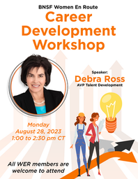
👩🚆 Women in Route
Developed event branding and marketing materials to spotlight women in the transportation industry. Deliverables included digital flyers, posters, and commemorative items aligned with BNSF’s brand voice.
🇲🇽 Hispanic Heritage Month
Designed culturally inspired graphics for internal celebrations. Assets included themed flyers, display graphics, and branded memorabilia celebrating Latinx identity.
🏃♂️ Trackathon (BNSF Hackathon)
Created bold, high-energy visuals for BNSF’s employee wellness race. I designed race bibs, event signage, and branded giveaways that captured the fun and spirit of the event.
🎄 BNSF & Tech Mahindra Holiday Party
Developed festive materials for a joint holiday celebration. Designed invitations, printed signage, digital promos, and photo booth graphics to create a joyful, inclusive atmosphere.
🛠 Tools & Deliverables
Tools: Adobe Photoshop, Adobe Illustrator
Assets: Flyers (digital + print), posters, signage, photo backdrops
Memorabilia: Mugs, t-shirts, stickers, race bibs, badges
Templates: Reusable layouts for future internal event use
🖼️ Visual Gallery (Insert thumbnails or carousel here)
Showcase your design versatility with event-based galleries or by deliverable type (flyers, print collateral, memorabilia).
🎯 Impact
These designs enhanced BNSF’s internal culture by elevating event visibility, fostering a sense of belonging, and turning everyday communications into memorable brand moments.
WER = Women En Route
Hispanic Heritage Month
Tech M Christmas
2022
2023
2024
Cloud Zeus (Logo)
{description}


Kudos and Recognition from clients


Comments