


- Elizabeth Valdelamar
- Mar 14, 2022
- 1 min read

Updated: Apr 17
Currently, in the progress of creating this Google/Coursera, I will update this Case Study and progress I go through the course! The most recent post will be updated on Instagram & Twitter! Will be also Designing the Logo for App

Randomly Generated Assignment

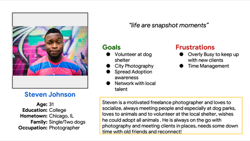
Persona's


Competitive Analysis
Looked at several potential competing companies, They are a Compete Market and can still infringe on the business' revenue & popularity. This is an opportunity to capitalize on this by bringing products from each company to create a one-stop-shop and less contact
The majority of the features between competitors were very similar, however the main differences that we noticed were: – Easily Accessible vs Hardly Accessible – Too Many Screens vs Simplified Interaction – Bright / Distracting Interface vs Minimalistic Interface – Specialization of Products


Preparing the Journey
By constructing a user flow of what a basic start to finish journey looks like while Reserving a table. This helps us in understanding the ways users can interact with the product, as well as allowing us to see navigation through user goals.

Storyboard:


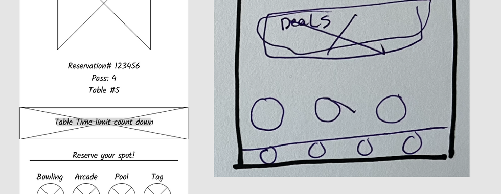
Paper Frame:


Digital Frame ( low fidelity )


Lofi Prototype:


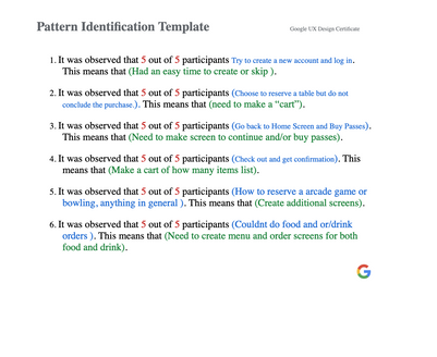
Observations into insights (Sticky Notes! - Used Miro.com)
Interviewing Potential Users, Organizing, and Identifying the Problems of observing people using the wireframe prototype, with the frustrations and needs of the users, adding additional screens that were needed to continue with the app.


Style Guide!
Color Scheme For the App


Comments